Android 17 is getting a new design, but it’s not Liquid Glass

Android teased its next major update with a glassy, iridescent Bugdroid, and people immediately assumed it was copying Apple’s Liquid Glass. Google’s Android chief says it isn’t.
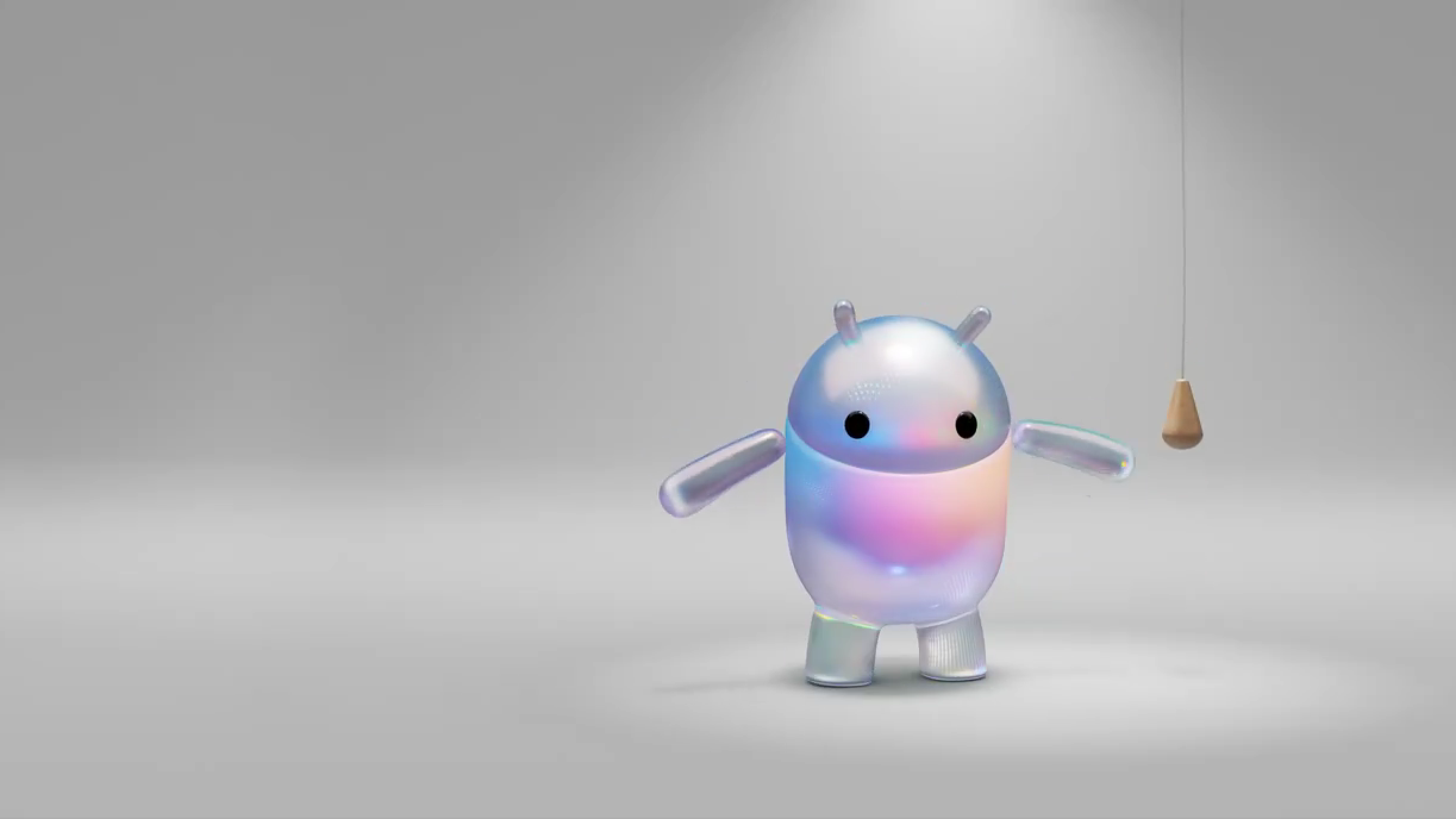
Google posted a short teaser this week showing the Android mascot rendered in a translucent, iridescent style with blur and refractive effects. The clip is tied to Android 17, which is expected to be shown at The Android Show on May 12.
The reaction was predictable. A chunk of the internet immediately accused Google of copying Apple’s Liquid Glass design from iOS 26.
However, Sameer Samat, Google’s President of the Android Ecosystem, shut that down directly on X. His response to a mockup showing what Liquid Glass might look like on Pixel was simple: it’s “not happening” on Android.
What Google is actually building on is Material 3 Expressive, its own design system that has been evolving across Android 16 and recent Pixel updates. Android 17 is expected to bring more blur to the interface, but blur and Liquid Glass are not the same thing. Apple’s design system goes well beyond a blur effect.
Some major Android manufacturers have gone a different way. Samsung has adopted floating button placements and menu layouts similar to Apple’s updated standards, and Oppo’s ColorOS is packed with glass-like UI elements. Google hasn’t followed their lead.