iOS 27 moves notification banners to the top-left, and it looks awkward
Apple shifted notification banners to the top-left corner in iOS 27, and the animation doesn’t look great in the early betas.
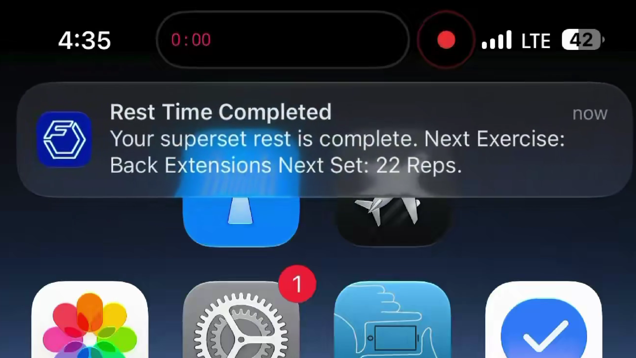
Apple made a subtle but immediately noticeable change in iOS 27: notification banners no longer drop from the top of the screen. They now slide in from the top-left corner instead.
The reason could be Siri, though Apple hasn’t said so explicitly. In iOS 27, swiping down from the top-center area near the Dynamic Island now opens the new “Search or Ask” interface tied to Siri AI, so shifting notifications to the top-left would make sense as a way to avoid conflicts, with the banner animation following that same logic.
It makes sense on paper, but in practice, it looks a bit off. Early beta users have flagged the animation as awkward and overly bouncy, with banners occasionally overlapping app icons on the home screen. It’s a small thing, but notifications are something you see dozens of times a day, and an animation that feels slightly wrong gets old fast.
Apple may or may not polish this before the public release in September, but for now it’s one of those beta quirks that makes you appreciate how much invisible work goes into making interface changes feel natural.